Connecting the Dots: ‘Regarding Warhol: Sixty Artists, Fifty Years’
Winding your way through the Metropolitan Museum of Art’s Warhol wonderland is a bit like trying to make sense of a connect-the-dots drawing. The shape and the subject are there somewhere but where? The Regarding Warhol: Sixty Artists, Fifty Years showcase gives us approximately 45 works by Warhol alongside 100 works by 60 fellow artists who, we are told in the press release, “reinterpret, respond or react to his groundbreaking work.” It’s a splashy circus of an exhibit, but will the real Andy please stand up?
No doubt about it — identifying Andy Warhol and his impact on modern art is a prodigious, and you might even say, overwhelming task. Mark Rosenthal, an independent curator, along with Marla Prather, a curator of Modern and Contemporary Art at the Met, and Ian Alteveer, an assistant curator, have served up a heady homage to the master of Pop Art. They have given us abundant examples of his experiments with painting and photography through his two-tiered silkscreen process, his revolutionary if sometimes unwatchable filmmaking, his obsession with celebrity — “Everyone will be world famous for fifteen minutes” — and his open acceptance of human sexuality in all its forms before the gay populace knew it could be liberated. They have even labeled one of the galleries “Queer Studies, Shifting Identities” which is commendable for such a stalwart institution as the Met. Then, as if in keeping with Warhol’s own ubiquitous night-after-night party at his own studio, the “Factory,” they have added an almost indecipherable blend of the great, the near-great, and some that might have been deserving of fifteen minutes but little more in the big picture. So, let’s look at some of the ingredients of this messy brew.
From the Bloody to the Banal
Warhol understood that advertising and the daily news in all their permutations were the key to understanding what made American culture tick. He had cut his teeth on the banalities of designs for Dr. Scholl’s Corns, 1961, promoting the doctor’s zino-pads, while reading about early race riots on the front pages. He enlarged and projected news clippings, then traced the images onto the surface of the canvas, a precursor to the silkscreen techniques he pioneered a year later. A good example of this can be seen in Birmingham Race Riot, 1964. Long before he received a near-fatal gunshot in 1968 from Valerie Solanas, a hanger-on and radical feminist from the Factory, he knew that the tabloids carried a darker message.
Vija Celmins’ Time Magazine Cover from 1965 reverberates in her monochromatic paintings a similar concern, utilizing smoking guns and falling planes in her iconography. In the wall labels we discover that she carried around images from magazines so she could “sift through them like playing cards.” Another woman, Sarah Lucas, one of the Young British Artists to come later, made silver prints entitled Hunk of the Year, depicting near nude males parading in front of a female audience, in order to reverse the male-female norm of such exhibitionism. Sigmar Polke’s entry Bavarian is notable for his own process of magnifying the image, then filling it in with a complex screen of black dots. The only legible text in his dark rendering is “Bavarian”; this southeastern section of Germany was a Nazi stronghold and for Polke, born in 1941, the word undoubtedly carried connotations perhaps lost on many viewers.
Roy Lichtenstein’s Ben-Day dot paintings in stark color are largely missing from this exhibit and would have provided a more dramatic counterpoint to Warhol’s soup cans and Brillo Soaps Pad Box. Lichtenstein, born in 1923, was a contemporary of Warhol (after signing with the Castelli Gallery which represented Warhol, he was taken to Warhol’s studio to study his works with consumer products) and his parodies of cartoon-like images of weeping women with bubbles of text, among many other examples of contemporary “kitsch,” put him on an equal footing with Warhol as a pop icon. Another artist whose fascination with popular culture is conspicuously absent from this show is Jasper Johns; the ambiguity of symbols, i.e. flags, target circles and numbers from the mass market were central to his work. Were these giants too competitive to be included with our pop icon in question?
Unquestionably, Big Campbell’s Soup Can, 19 cents (Beef Noodle) dominates its surroundings, its red and white halves with that signature yellow circle and black script spelling out banality in capital letters. According to research assistant Rebecca Lowery, in the accompanying audio guide, Warhol’s soup can is “as fastidious in treatment and as iconic an image as Monet’s haystacks.” That appraisal could spark a whole evening’s discussion of what constitutes art but adds a bit of skewed enlightenment to the tour.
Why the soup can in particular? The Warhol Foundation for Visual Arts, created in 1994, quotes Warhol’s response to that very question: “I wanted to paint nothing. I was looking for something that was the essence of nothing, and that was it.”
About Coca-Cola and its role in a consumer society, Warhol was quoted as saying that America started the tradition where the richest consumer could consume the same things as the poorest. “You can watch TV and see Coca-Cola, you know the President drinks Coca-Cola, Liz Taylor drinks Coca-Cola and just think, you can drink Coca-Cola too.” Warhol’s own silkscreen, acrylic, and graphite on canvas entry, Green Coca-Cola Bottles, 1962, is represented here. Another example of in-your-face consumer symbolism that juxtaposes oddly enough with Warhol’s Coca-Cola bottles is a Chinese Neolithic vase by artist Ai Weiwei from 5000 to 3000 BC, painted with a Coca-Cola logo. (I’ll leave you to your own opinion of Weiwei’s appropriation of the ancient vessel.)
A touch of whimsy which quickly catches the wandering eye is Gerhard Richter’s Kuh (Cow) from 1964. This farm animal in oil, using his soft grisaille technique, reminds one of the animals pictured on a child’s alphabet blocks. It anticipates Warhol’s Cow Wallpaper in the last room of the exhibit but the choice seems a bit of a stretch, with nothing in common between these works except the subject itself.
These first galleries are very busy with banal expressionisms. Damien Hirst’s pharmaceutical cabinet expresses his longtime obsession with the promises inherent in pharmaceuticals to heal and even ward off decrepitude and death. Polke’s yellow plastic tubs rendered in oil on canvas add a cheery touch. And let’s not forget Robert Gober’s plaster depiction of cat litter, painstakingly recreated in his studio. There are almost enough examples of consumer goods here to fill a shopping mall. During my own visit, I was aware of the same kind of purposeless ambling we associate with the mall visitor, trying to make sense of the too often senseless.
Many of these product representations have been beautifully rendered. What disturbs and confounds still is what they say about a society that has elevated their significance and enticed so many artists to celebrate or denigrate them. Warhol was one of the first to recognize consumerism as a controversially-heated subject for art. “Buying is much more American than thinking,” he professed, “and I’m as American as they come.”
Serving as a grim footnote to consumption as art, however unintentional, is Edward Ruscha’s Burning Gas Station. It’s a violent painting in its stark depiction of a station on fire and even more powerful in the impersonality it projects — as if an Edward Hopper style image caught outside of time had been suddenly set ablaze.
Celebrity – All for One and One for All
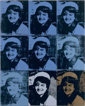
It is in this central section of the exhibit, focusing on celebrity in all its suspect glory, where Warhol and his artist companions shine. It is here also that the curators give us the biggest bang for our buck. Warhol’s silkscreened images are mostly derived from film stills, publicity shots, and newspaper photos. Their power is absolute — not just in the bold simplicity of his colors, i.e. Turquoise Marilyn, Silver Liz, Red Jackie, but in the sometimes haunting place his subjects hold for us in our constantly changing history. In his Nine Jackies, he chose to collect pictures of the First Lady in the weeks following the President’s assassination. He uses a close-cropped image of Jackie Kennedy in her infamous pillbox hat, replicated over and over again — a moment reproduced shortly before any shots were fired. Replication would become a Warhol device for highlighting, indelibly imprinting his subject on the public consciousness.
The “usual suspects” are represented here — Cindy Sherman, Jeff Koons, Julian Schnabel, and Chuck Close — and deservedly so. Sherman’s genius lies in self-photographing her constantly changing personas, a disappearance act that breaks down our own perceptions in the process. Her Untitled Film Stills used imaginary ingénues but here she pays homage to Marilyn Monroe in a casually dressed, highly vulnerable pose. Michael Jackson and his pet chimpanzee Bubbles sculpture by Koons, delivered in a blindingly gold ceramic glaze, offer up a tawdry theatricality. Hands-down, it’s a crowd pleaser. Schnabel’s portrait of Barbara Walters dramatizes his talent for broken-plate imagery even if one’s hard-pressed to find a likeness. A definite standout is Phil, the large-writ portrait of composer Philip Glass, in synthetic polymer on canvas. Close created over 150 heads of Glass in a variety of media when the composer was working as a plumber and taxi driver. “I wanted everyday people,” he recalled in the accompanying label, “not superstars, because that’s what Andy was doing.”
(Article continued on next page)