Broadway Posters: A Window to the Great White Way
Sometimes a limited run would entice buyers, make them nostalgic to relive the experience. An obvious favorite of his that unfortunately had a limited run was Dear World, the musical version of The Mad Woman of Chaillot, starring Angela Lansbury. The artist was Faye Gage, one of the few women working in the medium at the time, and with hat, gloves, a peacock feather and Angela’s eyes, she captures it all. One of Puckett’s favorite pastimes is recalling his encounters with Angela Lansbury. “That was a very heady time,” he confessed. When Lansbury was doing Gypsy, a gallery exhibition was held with the poster artist Hillary Knight, who also did the illustrations for Eloise, an enchanting story about a little girl who resides at the Plaza Hotel. Lansbury showed up at the exhibition opening and signed autographs for the Gypsy poster. “She is one of the most gracious and interesting people you could ever know,” he proclaimed. “She never hesitates to answer a question and she helps the Broadway community in any way she can.”
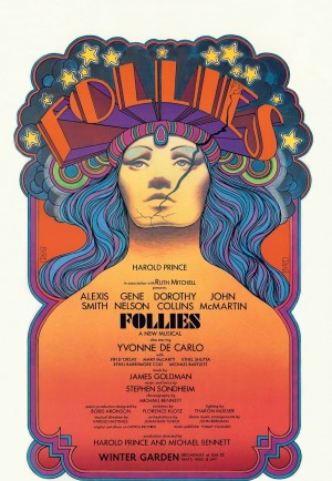
The walls are full of the ghosts of past productions. Some were chosen as the golden children, with large print runs, such as Follies, Cats, and Chorus Line, and others may have come and gone with quieter fanfare but they still reverberate in the room. Mae West is there, in a 1950s production of Diamond Lil for two weeks only. Shirley Booth smiles down in an Al Hirschfeld caricature from By the Beautiful Sea. There was more Hirschfeld. Carol Burnett from Fade In, Fade Out, with that open-mouthed shriek we all came to love, was very much present. Still more to grab the eye: Seesaw, The Great White Hope, Paint Your Wagon, some more successful than others, but all asking to be noticed.
Of course, it’s not all up to the producer or graphic designer. According to van Hoogstraten, “If the star is big enough, they will have approval.” Were there some stars that were less than thrilled to find themselves in an artist’s clutches? Oh, yes. According to Puckett, the poster run for Thirty-Three Variations starring Jane Fonda came to a screeching halt. “She’s very much a business lady,” remarked Puckett, “and she had not signed off for the poster to be merchandised and it had to be pulled. We couldn’t sell it, we couldn’t put it on the Internet, and we couldn’t do anything.” At this, he laughed remembering. “She’d go on line, to see if anyone was selling it.”
The brashly beautiful iconography of a David Byrd is counterbalanced by the delicate illustrations of poster artist James McMullan. The sketches of each and every poster he designed prove to the eye that a true master is at work. As Puckett remarked, “we’re grateful to Lincoln Center that they’ve kept him for over 20 years for all their productions.” Conversely, the first poster that helped to solidify his reputation was a gangly, almost grotesque caricature of Jonathan Pryce from The Comedians. More delicate but arresting illustrations can be seen in the collections, such as Light in the Piazza or the revival of A Delicate Balance. These sketches, and many others, are so gracefully executed that any actor should be grateful to be so immortalized.
There is another poster artist that should be mentioned in the same breath with Byrd and McMullan and that is Paul Davis. A poster that carried its message perfectly home to any theatergoer exemplified the Public Theatre’s production of Three Penny Opera. Its caricature of the derby-topped Raul Julia, with his large soulful eyes and blunt lips, created an unapologetic style ideally tuned to the world of Bertolt Brecht. It’s little wonder that Joseph Papp held onto Davis’ talents to promote the Public in the way that only Papp could.
With so many shows opening and closing every season, does Puckett ever worry about excess print runs? He pointed to the current running show, Newsies, as an example of a production he expects to have long-running success. “I asked Disney for a large run and I expect it will go into reprint.” He mentioned that the show had already played the Papermill Playhouse with great success. One of his biggest groups of buyers is schoolteachers. “The El Rancho High School in California ordered a bunch. They developed the play in their own workshop.” With such groups, he often offers discounts for a quantity order or in some instances, puts aside slightly damaged posters that such customers could use. But van Hoogstraten emphasized that “You have to be careful. You don’t want overexposure. Plus…” he added, “we hesitate to discount them that often. We’re in for the long haul. Just because a show closed doesn’t mean we have to unload 50,000 posters. There will be requests.”
The Internet has been a fast-growing source of income for Triton. Puckett estimates that such sales account for a good half of their income. Foreign sales have dropped off, particularly where the European audience is concerned. “They’re not Broadway-oriented,” he said. “It’s a cultural difference.” But he added that Japan used to be a big buyer, hungry for the splashy shows like Lion King and Wicked. One of the highest sales figures ever paid was $2,200 dollars for a Sondheim poster for “Do I Hear A Waltz?” Puckett quickly admitted that Sondheim productions were their biggest sale.
Yet poster art as an art form was meant from the beginning for immediate impact and short term consumption. As printing technologies evolved, designers jumped aboard. During the Belle Epoque period from 1880 to 1914, many typefaces were created to complement their illustrations. Broadsides, as they were called, were meant to be read from a distance and required large type. Lithographic processes allowed for hand lettering, which made the poster have greater appeal for serious artists like Toulouse-Lautrec, Bonnard and Mucha, the latter’s work becoming paired with Sarah Bernhardt’s theatrical powers. Italian and French Masters like Leonetto Cappiello created strong symbols — like the devil himself — to sell popular liquor. A.M. Cassandre utilized air-brushed surfaces in his majestic ocean liners, like the grand and beautiful Normandie poster. During the period from WWII to the fall of Communism, incredible images emerged — both satirical and surrealistic — from Polish poster artists. This became a testament for how subversive art could and did exist under such a repressive regime. The inherent drama in such political persuasion and product advertising opened the way for the mass acceptance of the theatre poster as it exists today.
In an interview with Mervyn Rothstein in 2007 for Playbill Magazine, Puckett summed up his passion for the theatre poster and its deeper meaning for us all. “They are a window into time. Theatre is ephemeral. A production exists only while it is running. Then it vanishes. The poster is a representation of that time. There’s immediacy. That’s why so many collectors take a poster in their hands and feel its texture. You can recall all the memories, good and bad.”
Departing this poster wonderland of the past and present, the real world seemed a little too noisy and gray. The colorful images I’d left back on Ninth Avenue were still dancing in my head. I took a detour through Shubert Alley and once again, a brick wall of broadsides full of the current shows grabbed my attention. I wasn’t the only one to linger over their spell.
Thanks to the conscientious care of individuals like Roger Puckett, there are new collectors to be found, new artists to carry this art form into the future. In Mame’s words, from the production of the same name, you have to “open a new window, open a new door.” Posters are here for the long haul.
